Visual Representation Examples

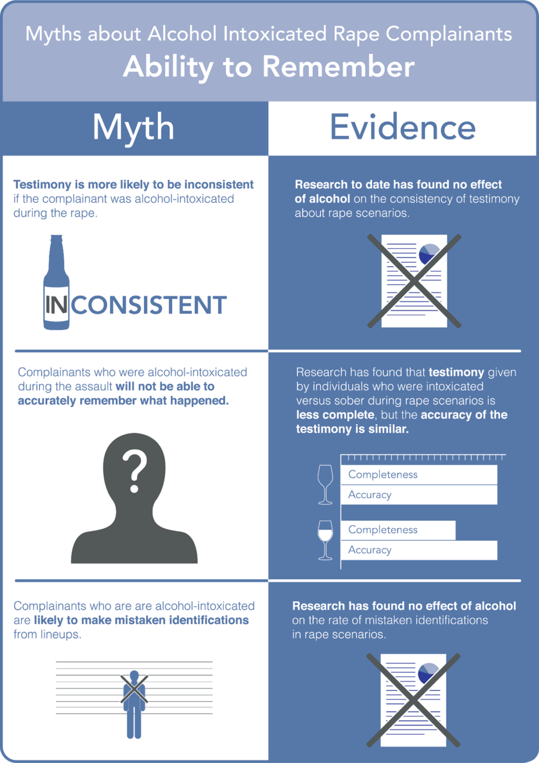
The infographic above (Figure 5.2.1) uses a simple monochromatic colour palette (variations of one colour). The title at the top clearly identifies the issue. The “Myth” and “Evidence” headings and columns visually organise the information and direct viewers from left to right in the anticipated reading order, with each box containing minimal, but targeted text that addresses each myth and accompanying graphics that function as visual analogies.
Figure 5.2.1. An infographic that was integrated into a policy brief targeting UK policing policies around collecting evidence from rape complainants who were intoxicated at the time of their attack (credit: Dr Heather Flowe and Fast Track Impact)
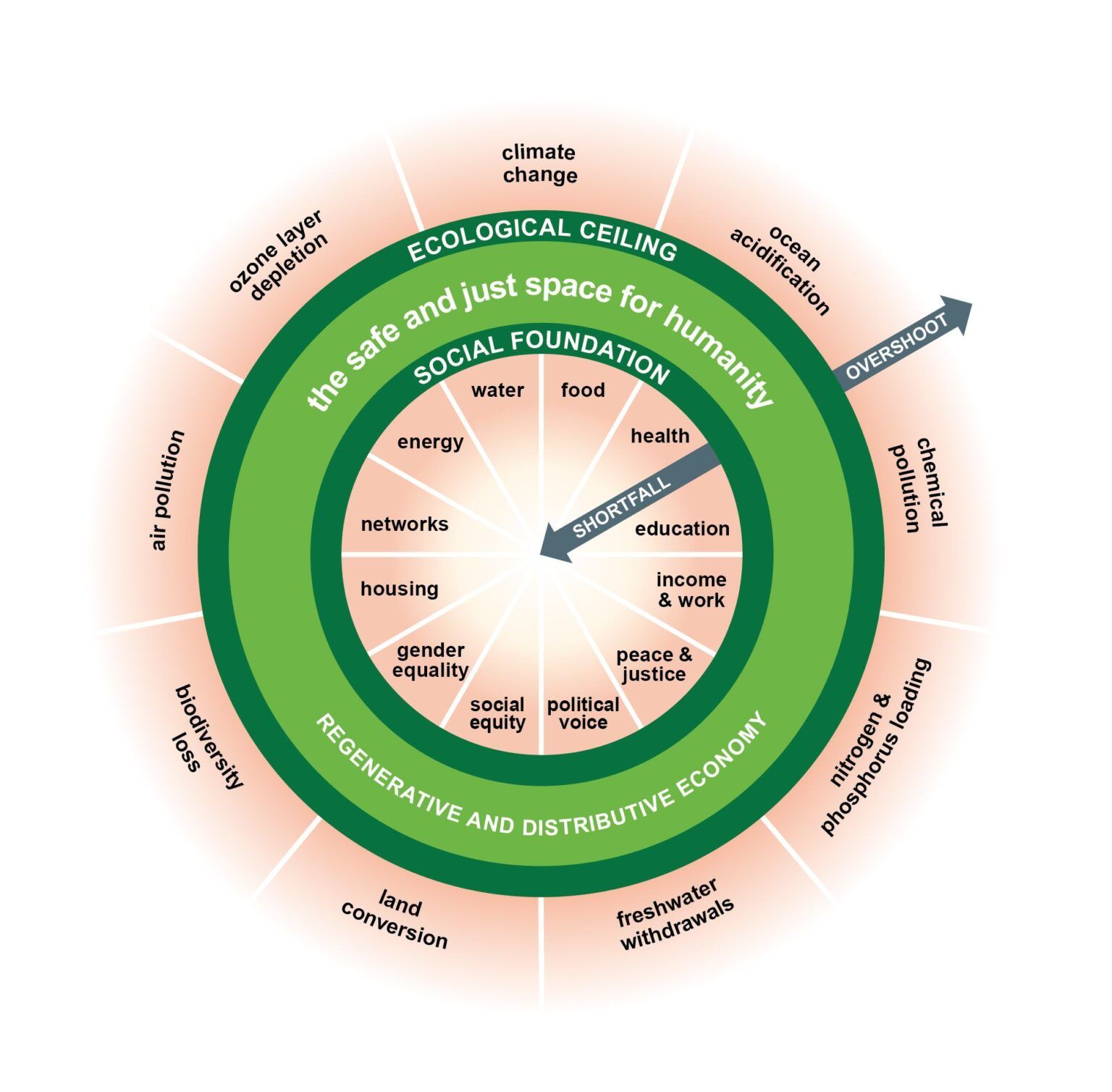
An infographic, which became known as the Doughnut Model, developed by Dr. Kate Raworth (see Figure 5.2.2), has led to interest from UN agencies and governments seeking to move beyond growth-based economic metrics, and influenced urban development policies in cities like Amsterdam, Portland and Philadelphia. Dan O’Neill from University of Leeds built on the doughnut framework to create an interactive dashboard that could be used by policy officials to design policies that encourage people to consume less, balancing quality of life with the limits of the planet, which informed Europe’s 8th Environment Action Programme.
Figure 5.2.2. Kate Raworth’s doughnut economics model (reproduced licensed under a Creative Commons Attribution-Share Alike 4.0 International licence)
In addition to showing the relationship between multiple variables, notice that the use of a complementary colour scheme (colours from opposite sides of the colour wheel) in the model above increases colour contrast so that the colours stand out. Complementary colour schemes should be used sparingly to keep colour from competing with the text elements.
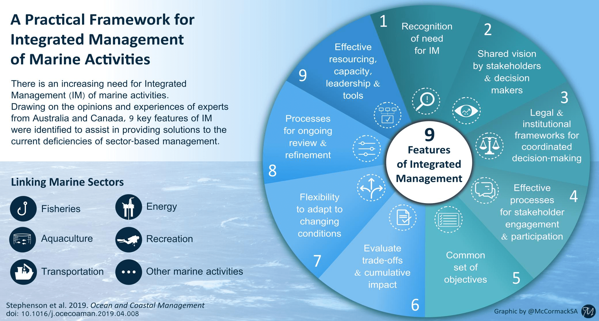
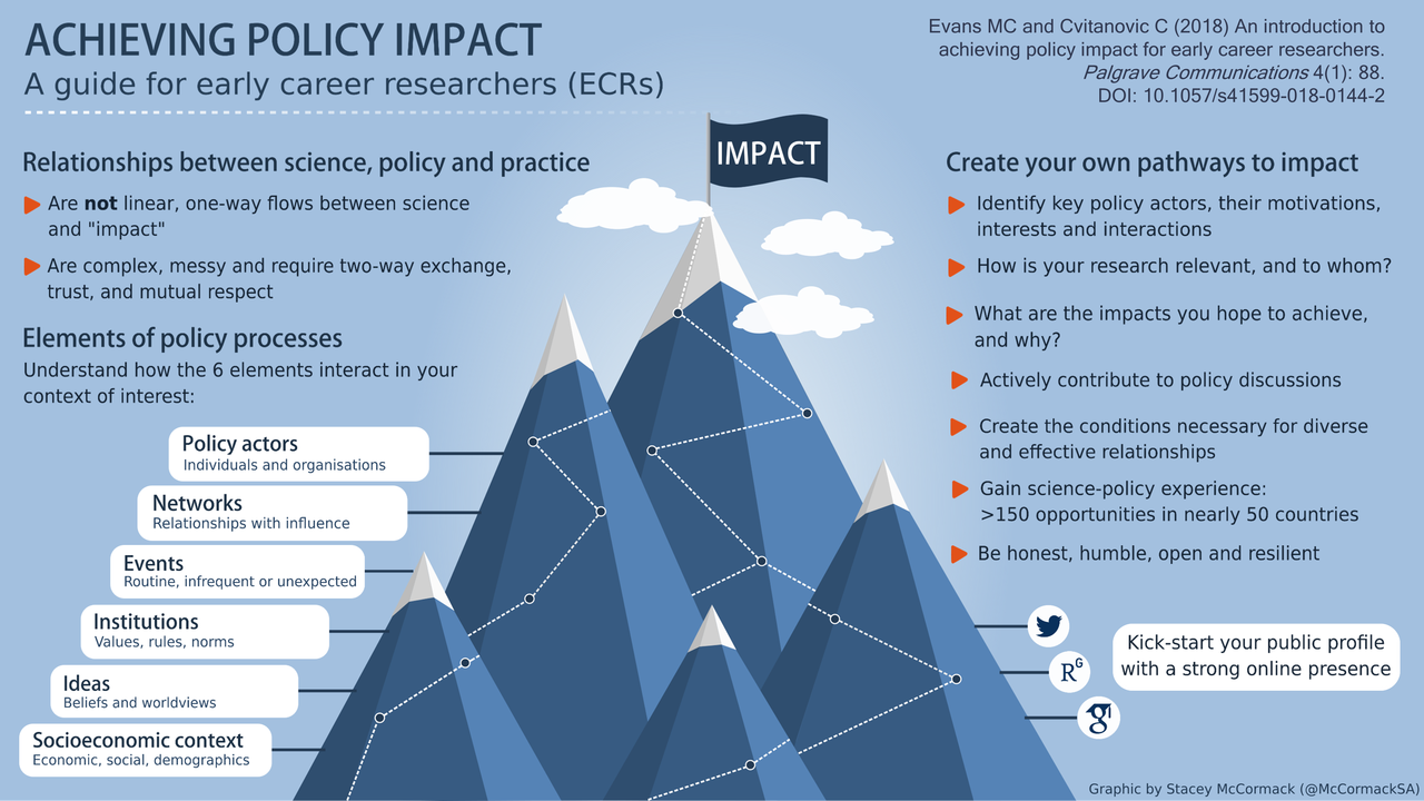
Chris Cvitanovic from University of New South Wales Sydney regularly turns papers he authors into infographics, working with researcher and scientific graphic designer, Stacey McCormack from Visual Knowledge Pty Ltd. See two examples of their work below, one targeted at policy bodies and organisations managing the marine environment, and one summarising messages from paper with Megan Evans providing guidance to early career researchers seeking policy impact.
Figure 5.2.3 below uses an analogous colour scheme (colours next to each other on the colour wheel) which creates a calm, less contrasting palette than the donut model above. The circle shapes repeat in different sizes, which adds variety, while linking visual elements across the infographic. Clear headings and sections organise the space, using minimal text and graphic icons that serve as visual analogies, enabling quick recognition of key ideas.
Figure 5.2.3 A practical Framework for Integrated Management of Marine Activities
Figure 5.2.4 below primarily uses a monochromatic colour scheme (variations of one colour) which gives it a clean, refined look. The repeated use of white (under the main heading, text boxes, mountain tops, clouds, and media icons) creates a visual flow through the infographic. The central visual element (mountains), acts as a visual analogy of the policy process journey. Clear headings and subheadings organise the content while still allowing enough open space to avoid crowding.
Figure 5.2.4. A collaboration between a researcher and graphic designer to turn papers into infographics, showing one targeted at policy bodies and organisations managing the marine environment (top), and one summarising guidance to early career researchers seeking policy impact (bottom). Credit: Stacey McCormack, Visual Knowledge Pty Ltd.


